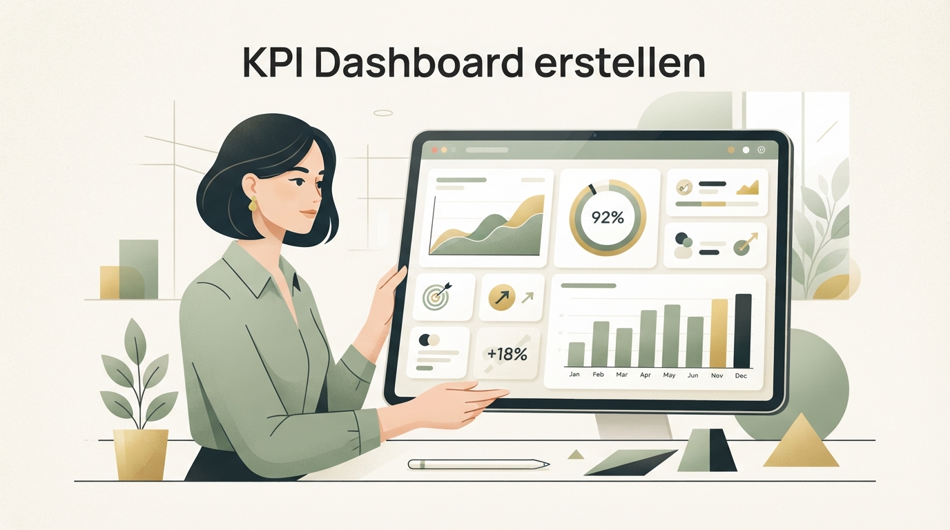
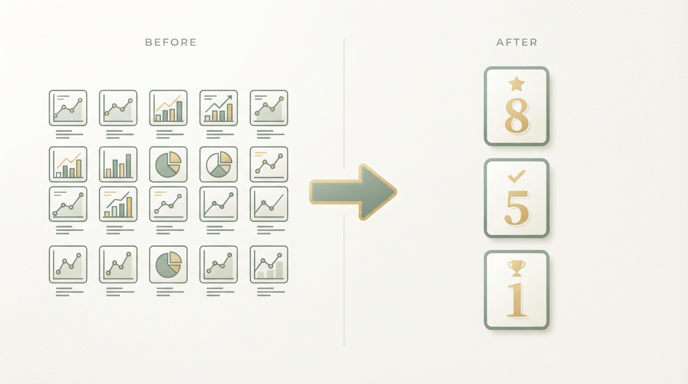
Building a KPI dashboard doesn't mean putting together thirty charts. It means finding the three to five numbers that tell you whether your SaaS is heading in the right direction, and looking at them every week. Everything else is decoration.
I made the exact mistake almost everyone makes when I started: I built a dashboard with twenty tiles because it felt productive. User counts, page views, social followers, app downloads, all lined up in color. Two weeks later I'd stopped opening it. Too much noise, not enough decisions.
Building a KPI Dashboard: Why Most Dashboards Fail
A KPI dashboard almost always fails because it shows too many numbers instead of the right ones. You build it once with a burst of energy, fill it with everything measurable, and three weeks later nobody looks at it anymore. The problem is rarely the technology. It's the selection.
Most founders confuse "I can measure this" with "I should measure this." Sure, you can track page views, impressions, likes, app store ratings. But none of these numbers tell you whether you'll still be making money in two months.
Vanity metrics feel good because they almost always trend upward. More followers, more downloads, more clicks. The problem: they tend to correlate weakly with what actually matters — paying customers who stick around.
Choosing Your KPIs: The Three Numbers That Actually Drive Decisions
Choosing your KPIs means finding the numbers, specific to your business model, that show cause and effect — not just activity. For a small SaaS, three categories are almost always enough.
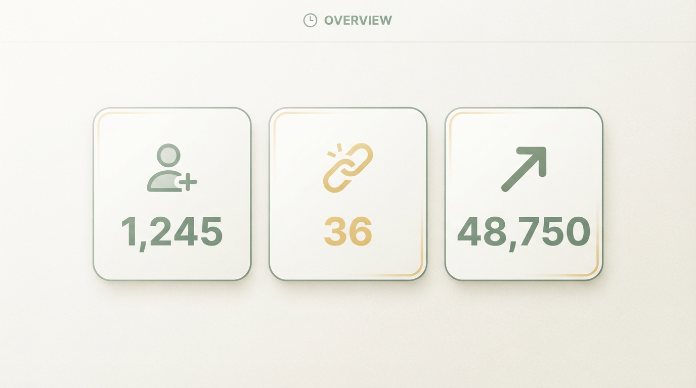
1. New paying customers per week
This is your pulse. Not trial signups, not newsletter subscribers — people who actually paid money. If this number drops over several weeks, you have an acquisition problem, no matter how good your traffic graph looks.
2. Churn vs. retention
How many customers cancel each month, and how many are still using your product after 30, 60, 90 days. A high churn rate eats up every marketing win you get. You can pour customers in the front door all you want — if more are falling out the back, you're just spinning your wheels.
3. MRR and what's driving it
Monthly revenue itself matters, but what it's made up of matters even more: new subscriptions, upgrades, downgrades, cancellations. That breakdown tells you whether your growth is organically stable or just being carried by one big customer.
These three areas beat almost any other number for signal. Rob Walling often describes a similar principle in his work on bootstrapping: focus on the metrics directly tied to revenue and retention — everything else is secondary.
Avoiding Vanity Metrics: A Checklist
A metric is usually vanity if you can't say what action would change once it goes up or down. That's the simplest test I know.
Ask yourself, for every number: if it drops 20 percent tomorrow, what would I do differently? For follower counts, the answer is often: nothing. For new paying customers, the answer is almost always: I'd go straight to my acquisition channels and start digging.
| Metric | Feels good | Actually drives decisions |
|---|---|---|
| Social media followers | yes | no |
| Page views / traffic | yes | partially |
| Trial signups without conversion tracking | yes | no |
| New paying customers per week | fairly neutral | yes |
| Churn rate | fairly uncomfortable | yes |
| MRR breakdown | neutral | yes |
That doesn't mean traffic is useless. If you're currently working on building organic traffic, traffic is a stepping stone, not an end goal. It only becomes a real metric once you connect it to conversion rate.
Staying On Top of the Numbers: The Weekly Rhythm
Staying on top of the numbers means, concretely: a fixed weekly slot, thirty minutes, the same three to five numbers every time. No ad-hoc glances, no dashboard you only open when panic sets in.
I do mine on Monday mornings now, before the day gets cluttered with everything else. Ten minutes is often plenty if the dashboard is lean. The question is never "does this look good," it's "what changed, and why."
A dashboard without this rhythm is just a pretty spreadsheet. The value comes from repetition, not from building it once.
How to build it, technically
For most small SaaS companies, a simple setup is enough:
- Pick your data source: Stripe or your payment provider for revenue numbers, your database or a tool like Mixpanel for user behavior.
- One central board: Google Sheets with formulas, Notion, or a specialized tool like Baremetrics or ChartMogul once you have some revenue coming in.
- Automate the updates: Manual copy-paste dies out after two weeks. Use an API connection or a Zapier-like tool that pulls the numbers automatically.
- Three numbers big, everything else small: Your core KPIs on top and large, everything else below and small, if you include it at all.
What Other SaaS Companies Actually Track
A look at real products shows how differently the relevant numbers can look depending on the business model. At Diode, an AI platform for PCB design, the number of finished, exported circuit schematics per customer is likely a central metric — not just signups.
For an API product like Snaptrade, which connects fintech apps to brokerage accounts, what probably matters most is the number of actively connected accounts per week, since that shows directly whether developers are really using the product in production and not just testing it.
These numbers are estimates from our research database, not official figures from the companies. But the pattern behind them is instructive: every business model has its own "activation action" that correlates more strongly with revenue than generic usage numbers.
Common Mistakes When Building a Dashboard
The biggest mistake is being too ambitious the first time around. You try to measure everything at once and lose the overview before you've even started.
Second mistake: no clear definition of what a number actually means. Is an "active user" someone who logged in, or someone who used a core feature? Without a clear definition, you eventually end up arguing about the number itself instead of what to do about it.
Third mistake, and the one I see most often with young SaaS founders: copying the dashboard of a much bigger company. A dashboard with twenty segments makes sense at 5,000 paying customers. At 12 customers, you don't need that. Instead, take a look at how to find product-market fit in the first place — different signals matter in this early stage than later on.
How Your Dashboard Connects to Your Strategy
A dashboard is only as good as the decisions that come out of it. If your churn is rising, you probably need better onboarding copy or a conversation with churning customers, not a new chart. If your new-customer number is stagnating, the problem usually isn't the dashboard, it's your acquisition — maybe ad copy that isn't convincing, or channels that just aren't working.
That exact step — actually connecting the numbers to a concrete strategy — is something almost nobody does alone at the kitchen table. At Starte.ai, we continuously analyze data from thousands of real projects to see which channels, which audiences, and which metrics actually correlate in which markets. Through that work, we've been involved in generating over 125,000 leads, and some of our projects have helped build seven-figure revenues. If you'd like, you can book a free initial strategy call and find out which numbers might actually matter for your specific business model.
From Dashboard to Your Own Mini-Tool
Some founders eventually build their own small internal tool instead of endlessly patching Google Sheets. That can be worth it once you notice you're repeating the same manual steps every week.
If you're still unsure which no-code tool fits an internal dashboard like this, it's worth checking our comparison of no-code tools for SaaS before committing to a stack.
Build your dashboard this week with exactly three numbers, not twenty. Put a fixed slot in your calendar, open the dashboard there, and don't touch the selection until you've collected at least four weeks of data. That's really all you need to start.
Frequently asked
How many KPIs should a small SaaS dashboard have at most?
Three to five core KPIs are plenty for most early-stage SaaS companies. More numbers usually don't mean more clarity — they mean more distraction from the decision that actually matters.
Is Google Sheets enough for a KPI dashboard, or do I need a tool?
Google Sheets is often completely sufficient at the start, as long as the formulas are kept clean and the data sources feed in reliably. A specialized tool usually only pays off once manual data entry becomes too error-prone or time-consuming.
How often should I look at my KPI dashboard?
A fixed weekly slot works better for most small teams than checking in daily, since individual days can swing wildly. Weekly trends are a better signal for whether something's actually changing.
What's the difference between a vanity metric and a real KPI?
A vanity metric often changes without giving you any concrete action to take, while a real KPI points you directly to where you should intervene. The simplest test: ask yourself what you'd actually do if the number dropped 20 percent tomorrow.
Written by
Bohdan BernatekFounder, Starte.ai
Founder of Starte.ai. Built a business to 125,000+ organic leads and seven-figure revenue — and now works with founders personally, deriving a strategy for their own brand from data across thousands of real projects and producing the creatives for it.