Building a Landing Page: The One Sentence Everything Starts With
A landing page is a single page with a single goal: getting visitors to take an action — sign up, buy, call. It works because it doesn't distract.
Concretely, a good landing page does four things:
- It tests an idea in a measurable way, instead of you guessing
- It validates before development, before you sink time into code
- It works as a fake-door test: put the page live, measure interest, then build
- It forces you to boil your offer down to a single sentence
That's exactly the point of building a landing page: no menu with ten subpages, no distractions. Unlike your regular website, which tries to cover everything, a landing page has just one job. You test an idea, an offer, an audience — and measure whether people respond.
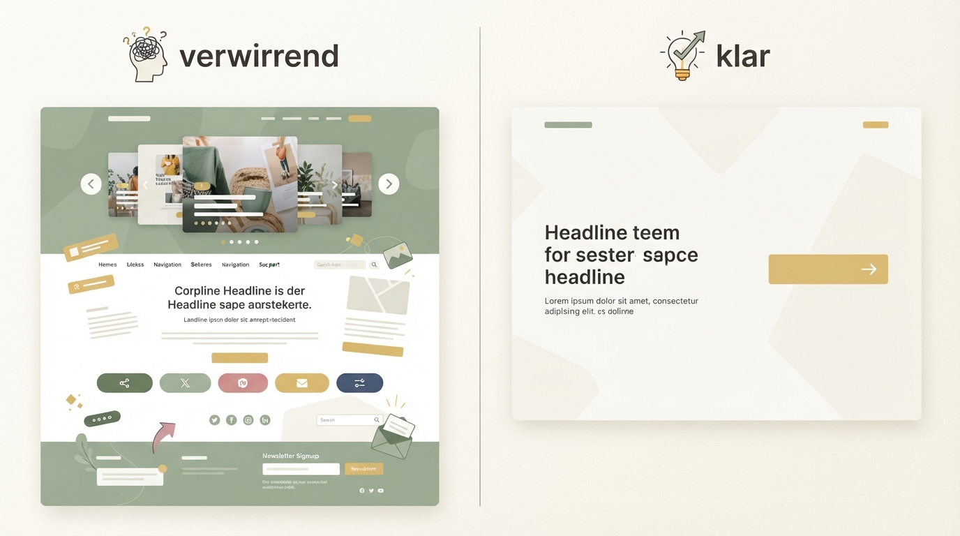
I got this wrong myself at the start. Nice design, great icons, a video up top — and still barely any signups. The most common mistake: beautiful design, but visitors can't tell what the product does within 3 seconds.
Building a Landing Page: The 6 Steps
The steps below build on each other. Don't skip any, even if you're in a hurry — the order is really the trick.
Step 1: Nail down the one promise
Before you even open a tool, write a single sentence: what does the customer get, and why is that better than what they're doing now? No marketing fluff, no three benefits at once.
One sentence. Example: "Find profitable SaaS ideas backed by real revenue numbers, instead of guessing for days." That's concrete, it's an outcome, and it's understandable with zero background knowledge. If you show your sentence to three different people and all three get the same thing from it, you've got it.
Step 2: Plan the fold properly
Above the fold is the part of your page people see without scrolling, and it decides whether anyone keeps reading at all. Exactly three things belong here: the headline with your promise from Step 1, a short subline that makes it concrete, and a button that clearly names the action.
For our example above, that might look like: headline "Find profitable SaaS ideas in minutes," subline "Real revenue numbers instead of gut feeling, from over a thousand analyzed micro-SaaS," button "Start free now" instead of "Learn more." No slider, no three different buttons, no autoplay video. The more options you show up top, the more people choose to do nothing at all. That's not a matter of taste — it's just how attention works.
Step 3: Structuring your landing page in the right order
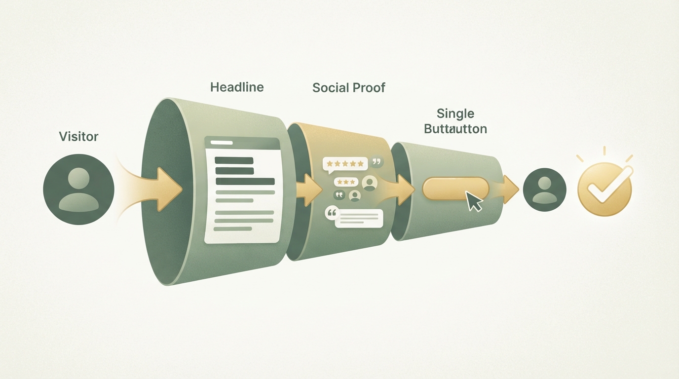
Landing page structure should ideally follow the logic of how a stranger builds trust — not the logic of how you think about your own product. After the hero section usually comes: naming the problem, then your solution, then social proof, then addressing objections, then one more clear call-to-action.
Many founders flip this and put features right at the top. But nobody buys a feature. People buy a solution to a problem they currently have. Only once someone recognizes their own problem do they care how you solve it.
| Order | Common mistake | Better |
|---|---|---|
| 1. Hero | Three messages at once | One promise, one button |
| 2. Problem | Skipped entirely | Short, concrete, in customer language |
| 3. Solution | Just a feature list | Feature + benefit in one sentence |
| 4. Proof | Missing completely | Numbers, quotes, real names where possible |
| 5. Objections | Ignored | FAQ or short paragraph |
| 6. CTA | Only once, at the very top | Repeated, same wording |
Step 4: Write copy that answers questions instead of selling
Good landing page copy reads like an answer to a question your visitor is already asking themselves, not like an ad. Write each section as if you were explaining to a friend on the phone what you built and why it helps them.
Avoid vague adjectives like "innovative" or "unique." They say nothing. Instead, write what actually happens: "You get a list of five ideas in 30 seconds, ranked by estimated search volume." That's something people can picture. The other thing isn't.
Step 5: Boost landing page conversion through the details
Landing page conversion rarely comes from one big trick — it comes from removing a lot of small points of friction. Load time under two seconds, a form with no more than two or three fields, a mobile view that's just as thought-through as desktop, and button text that describes an action instead of a generic "Submit."
One thing almost everyone underestimates: the time between the click and the result. If someone clicks "Start for free" and then waits five seconds for a page to load, or lands in a long signup flow, you lose them again. Shorter is almost always better, even if it feels incomplete to you.
For context, since the number alone doesn't say much: cold traffic often converts at 1–3%, because people don't know you yet. With warm traffic — say, from your own community or email list — 5 to 10% is more realistic, because trust is already there. With paid search traffic that has clear purchase intent, it can be even higher. These are commonly cited rules of thumb from practice, not lab values, and without distinguishing by traffic source, any blanket percentage is barely more than a rough direction.
If you want to go deeper into the psychology behind why visitors don't buy even on a good page, the article on optimizing conversion is a good companion to this one.
Step 6: Test, measure, adjust
A landing page is never finished — it's a draft you keep improving. Set up a goal event in Google Analytics, like "form submitted" as a conversion goal — that's the very first event you need just to see how many visitors take the action. Only once that's running should you add further events like "button clicked" for individual sections.
If you want to know why people leave, not just that they do, you can also bring in Hotjar. Start by looking at the heatmap for your above-the-fold area: how far do people even scroll before dropping off? That tells you right away whether your hero section delivers on its promise, before you worry about finer details further down.
Then test one thing at a time: the headline, or the button text, or the order of sections. Never everything at once, or you won't know in the end what actually made the difference.
If you're under 1%, regardless of traffic source, the issue is usually somewhere in the structure itself, not the color of the button.
How real products use their landing page
I looked at three successful micro-SaaS products that get this right. Diode, for example, targets hardware developers and explains right at the top what the tool does with code, without detouring through generic marketing language.
With B2B tools like Vector, which identifies anonymous website visitors, you often see a different pattern: the landing page first explains a problem many marketers know well (visitors show up, but nobody knows who they are) before the product is even shown.
In both cases, the above-the-fold zone is built almost identically: one sentence about the problem or outcome, one line of context, a single clear next step. That works across industries, even when the target audiences are completely different.
Landing page vs. regular website: what you actually need
Many founders start out building an entire website with five subpages, even though a single landing page would be completely enough.
| Landing Page | Regular Website | |
|---|---|---|
| Goal | One action | Information about the company |
| Scope | One page | Multiple subpages |
| Fits | Validation, launch, ads | Established brand |
| Build time | Often one to two days | Often several weeks |
| Distraction | Minimal | Menu, footer, subpages |
For the validation phase, a landing page is almost always enough. It's only once you have several audiences or products that need to be explained separately that a bigger website makes sense. Before that, it's often just extra work that distracts from the real question: is anyone actually buying?
If you're already collecting interested leads in parallel before the product is finished, the article on building a waitlist is worth a look too, since a landing page and a waitlist often complement each other in practice.
From copy to finished page: tools and execution
For the technical build, you no longer need a dev team. A simple page builder or an AI editor is enough to put together copy, images, and a form — as long as you've already thought through the structure from the six steps above.
That's exactly where I'd start myself, instead of jumping straight into clicking around an editor: clarify the idea and audience first, then build the page. If you're not yet sure whether your product idea has enough demand in the first place, Starte.ai's Trend Finder is a good first step to get real market signals instead of just a gut feeling before you build.
Once the idea is solid, the Blueprint tool helps you turn a plain idea into a concrete MVP feature set and ready-made prompts for your AI editor (like Claude or Cursor) — including the structure for this exact landing page.
Don't build your landing page as a design project — build it as a test for a message. One promise, one button, then measure. Everything else comes after.
Frequently asked
What belongs on a good landing page?
Above the fold, exactly three things are enough: the headline with your promise, a short subline that makes it concrete, and a button with a clear call-to-action like "Start free now." Anything else just distracts and lowers the chance that anyone reacts at all.
How should a landing page be structured?
After the hero section, the ideal order is: the problem, then your solution, then social proof like testimonials or numbers, then objections addressed as FAQ, and finally one more clear call-to-action. This order follows how visitors build trust, not the founder's feature logic.
What's a good conversion rate for a landing page?
For many SaaS landing pages, 2 to 5% is considered typical, but it depends heavily on traffic source and offer and isn't a fixed rule. If you're under 1%, the problem is usually in the page's structure itself, not details like the button color.
What's the biggest mistake when building a landing page?
Most people build a pretty page first and only think about conversion afterward, when it should be the other way around. It starts with the one sentence a visitor needs to understand in three seconds, and only then is the page built around it.
Written by
Bohdan BernatekFounder, Starte.ai
Founder of Starte.ai. Built a business to 125,000+ organic leads and seven-figure revenue — and now works with founders personally, deriving a strategy for their own brand from data across thousands of real projects and producing the creatives for it.