Creating Brand Guidelines: The First Truth About Brand Guidelines
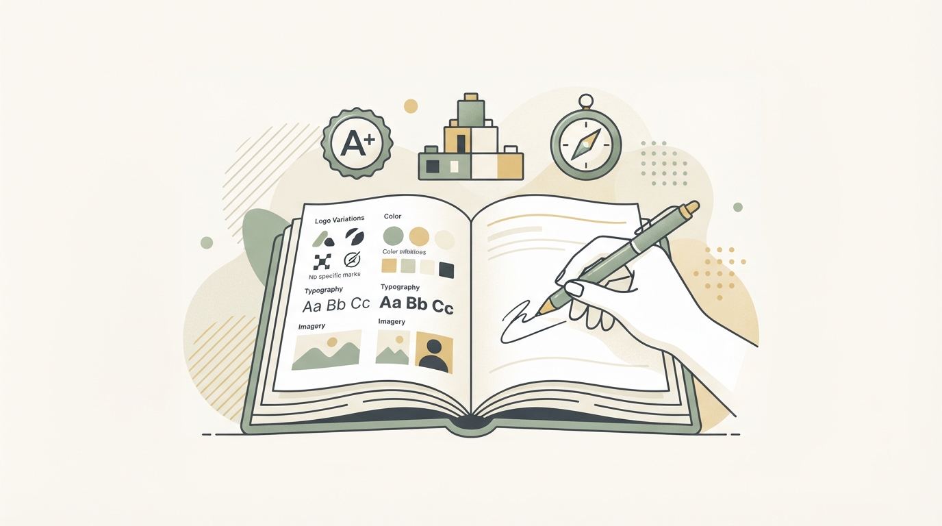
Creating brand guidelines? That doesn't mean building a 50-page PDF nobody reads. It means writing down rules your team will use TOMORROW, because they're concrete and save time. So what actually needs to be in there, and what's pure waste?
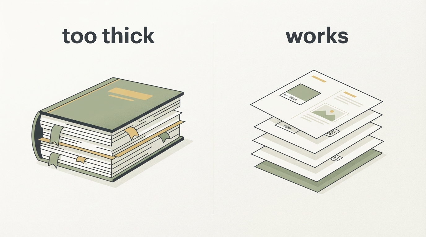
I see this over and over: founders spend weeks on comprehensive brand guidelines with Pantone numbers for seven different contexts — and in the end, the intern still uses a completely different font for the next newsletter, because the PDF was too long and too specific. The best style guide isn't the most perfect one. It's the one that works.
The Minimum: These 5 Elements Belong in Every Style Guide
A working brand guidelines collection needs exactly these things — no more, no less:
1. Logo and Spacing (Including Clear Space)
You need the logo in at least three variants: horizontal, symbol alone, and a variant for small spaces (favicon, profile picture). Most important: specify concrete spacing — not "enough room," but "minimum X millimeters of clear space from other graphics." Many style guides forget that the logo also shouldn't be crammed against the edge of the page. Clear space is a rule, not decoration.
Also write down what you're NOT allowed to do — logo distorted, stretched, with filters, in invalid colors. A picture says more than a hundred words.
2. Color Palette with Hex Codes (Not Just Names)
Five to seven colors, done. One primary color, two or three secondary colors, plus gray, white, black. Write the hex code next to each color, and optionally the RGB value — so any designer, any developer can use it immediately. Don't just name the color itself, but also what it's meant for: "Primary Blue #0055FF for buttons and links," not just "Our Blue."
Specific means it can be used. Vague means it gets ignored.
3. Typography: Two Fonts, Done
Choose one font for headlines, one for body text. That's enough. Most founders make the mistake of picking four different fonts — which just leads to chaos. Write down the size and weight (Regular, Bold, etc.) each font is used at. A real example: "Headlines: Inter Bold, 32px on desktop." Not "large" — concrete numbers.
Also note where the font can be sourced — Google Fonts link, Typekit subscription, or if it's a paid license, how to get it.
4. Photography and Image Style (One Concrete Rule, Not a Vision Statement)
If you feature yourself in your campaigns, or photos of customers, describe that. "Authentic photos of real people, no stock-photo look" is vague. Better: "Medium close-up portraits, natural light, eyes on the camera or toward the action, no staged poses." If you use a filter or color grade, document it.
Don't forget example photos. Just one screenshot. That saves the next graphic designer a round of questions.
5. Tone and Voice (Two to Three Rules, Not an Essay)
How do you talk to your audience? Casual or formal? This isn't the place for a long text about your brand values — that's not what a style guide is for. What belongs here are concrete rules: "We write casually, like we're sitting at a table with someone. No marketing buzzwords like 'revolutionary' or 'finally.' Short sentences. Concrete numbers instead of 'many.'"
One example of language that fits. And one that doesn't. Done.
That's it. Everything else is a distraction.
The Biggest Mistakes When Writing a Style Guide
Mistake 1: Too Much Philosophy, Too Little Practice
Style guides full of sentences like "our brand embodies innovation and trust" are useless. A designer needs to know whether the font can be all caps or not. Whether the logo works on a colored background. Not what our inner values are.
Mistake 2: Too Many Variations
"We have three different logo versions, five color palettes depending on context, and eight font-size rules." That just means nobody can keep track anymore. Simpler is better. One color palette. Two fonts. Two logo variants. That's all you need.
Mistake 3: No Concrete Measurements
"Generous spacing from the logo" vs. "At least 30 pixels of spacing to the left." Guess which one works? Concrete numbers leave no room for interpretation. That saves you follow-up questions.
Mistake 4: Not Keeping It Updated
A style guide that sits unchanged is dead weight. If your design evolves, update the guide. Otherwise all new work ends up half a step away from the rules.
The Structure: How to Build a Style Guide People Actually Use
This structure works in practice:
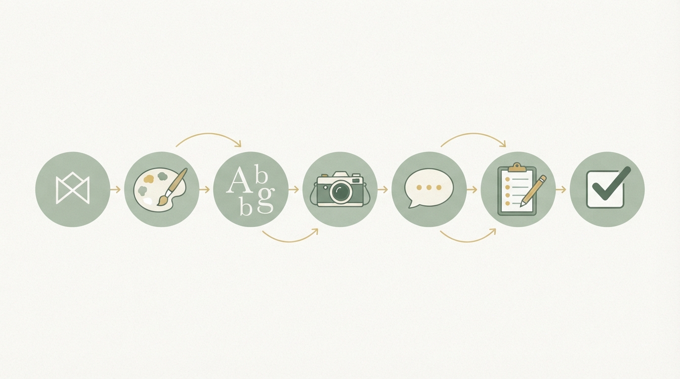
1. Cover + Contents (30 seconds) Logo, founding year, one sentence: who are you? Table of contents.
2. Logo (1 page) Four versions: horizontal, symbol, variant for small spaces, clear-space rule.
3. Colors (1 page) Palette with hex codes, one usage rule per color (e.g. "Primary only for buttons").
4. Typography (1 to 2 pages) Two fonts, sizes used, link to download or license.
5. Photography and Image Style (1 page) 3–4 example photos, one rule per example.
6. Tone and Voice (1 page) Concrete rules, one example of "how we talk," one of "not this."
7. Don'ts (1 page) What NOT to do, visualized.
Total: 6 to 8 pages. Done.
If you need more than ten pages, you've collected too many rules. That's not a bad thing per se — it's just not a style guide anymore, it's a book about your brand. That has its place, but not in day-to-day work.
When Do You Need More Than the Minimum?
There are cases where a thicker style guide makes sense:
- You have decentralized design (multiple locations, partners, agencies): then it can be a 15-page document that explains things in more depth.
- Your product is visually complex (like a software interface with many states): then you need a component library, not just a style guide.
- You're a large brand with multiple sub-brands: then a master guide with derivatives makes sense. These corporate design rules interlock with each other but should still trace back to a shared foundation.
But: these are exceptions. Start small. Build the style guide you need TODAY. You can always expand it later.
The Best Style Guide Is a Test
There's a simple practical test: give your style guide to someone who doesn't know your brand — a freelance designer or an intern — and say, "Make me an Instagram story following this guide." If that person manages it without three follow-up questions, the style guide works. If not, it's too vague.
That sounds trivial, but: many founders have style guides that nobody but themselves understands. Not because there's a lack of detail, but because there's too much detail, and the important parts get lost.
That's exactly the mistake most people make when building their brand guidelines. They think more information helps — but information overload is the opposite of clarity. A good guide answers the questions your team asks DAILY: Which color? Which font? Which tone? Everything else is nice-to-have.
If you want to approach this systematically — not just create a style guide, but first clarify the brand itself — you'll find a better starting point with brand workshops. At Starte.ai, we help you not only create the guidelines, but also build the system behind them: What works in your market? How do you talk to your people? Which images land? That's the foundation the style guide actually rests on. The first strategy call is free.
Frequently asked
How many pages should a style guide have?
In practice, 6 to 8 pages are completely sufficient if you stick to logo, colors, typography, image style, and tone. If you need more than ten pages, you've usually collected too many rules — at that point the style guide turns into more of a book about the brand. Exceptions exist only for decentralized design, visually complex products, or multiple sub-brands.
Which colors belong in a brand guideline?
Five to seven colors are enough: one primary color, two to three secondary colors, plus gray, white, and black. It's important to note the hex code for each color and write down what it's meant for, for example 'Primary Blue #0055FF for buttons and links.' The color name alone doesn't help anyone implement it.
How many fonts should you set in brand guidelines?
Two fonts are completely sufficient — one for headlines and one for body text. Many founders make the mistake of specifying four or more fonts, which ultimately just creates chaos. It's also important to specify sizes and weights concretely, such as 'Headlines: Inter Bold, 32px on desktop.'
Why do many style guides fail to work in practice?
Most fail because they contain too much philosophy and too few concrete rules, like 'our brand embodies innovation' instead of clear specifications for logo, color, or font. Vague statements like 'generous spacing from the logo' instead of 'at least 30 pixels' lead to follow-up questions and misuse. A good test: give the guide to someone who doesn't know the brand and see if they can follow it without asking questions.
Written by
Bohdan BernatekFounder, Starte.ai
Founder of Starte.ai. Built a business to 125,000+ organic leads and seven-figure revenue — and now works with founders personally, deriving a strategy for their own brand from data across thousands of real projects and producing the creatives for it.