How to design static ads: why static ads still work
Static image ads follow the same rules as video, they need a clear hierarchy, mobile-friendly formats (1:1 or 4:5), high-contrast text, and one focus per ad. The upside: no camera, no editor, no music needed. A good static ad can run for weeks or even months, while a video often starts to feel stale after 3–5 weeks.
Here are the five things that matter, whether you're designing static ads or any other format:
- Hierarchy: one message per ad, everything else takes a back seat
- Format: 1:1 or 4:5 instead of 16:9 for mobile
- Text on the image: max 5–7 words, strong contrast
- Mobile-first test: check the ad on a real phone before going live
- Color: one element that breaks from what competitors are doing
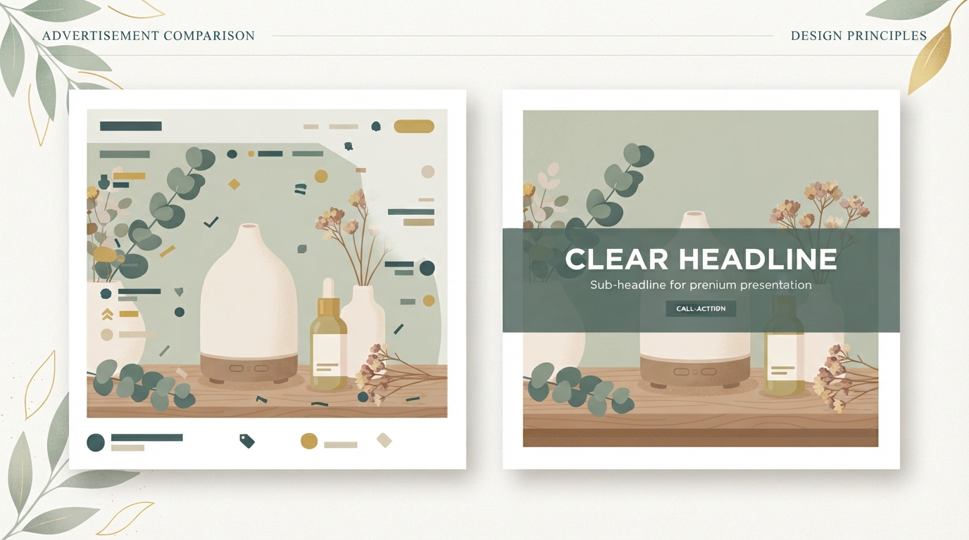
Most ad images look like nothing: the subject is small, the text only readable on desktop, the focus unclear. On a phone, it's just a blurry smudge. And gone.
I see this constantly: shops post their best product photo and expect it to work as an ad. It doesn't.
Step 1: Hierarchy — one message per ad
You have three seconds before someone scrolls past. What do they need to understand in that time?
Just one thing. Not three.
Hierarchy means: one visual or textual focal point, everything else subordinate to it. A dominant image or a piece of text that overrides everything else, with the rest simply supporting that one point.
Example: you're selling a copywriting course. Don't show: the product image AND the course title AND reviews AND a countdown timer. Show: one big, clear line about the benefit (e.g. "Your product copy isn't selling? Here's why.") — and that's it. The image is just the frame around it.
If you can spot more than two pieces of information on the ad, it's too crowded.
Try it yourself: pull up a few competitor ads on Instagram or Facebook. How long does it take you to understand what they want? If it takes more than a second, they got the hierarchy wrong.
Step 2: Image format — not too small, not too crowded
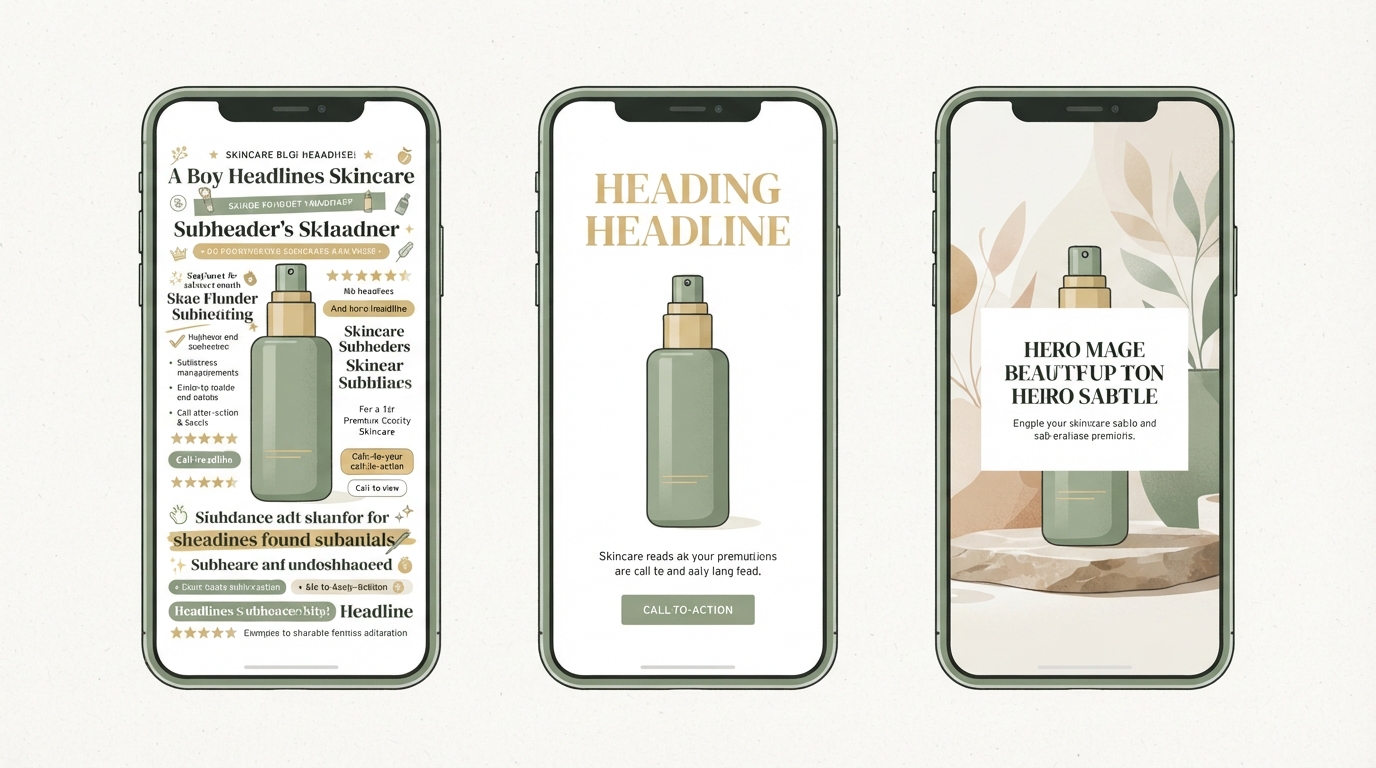
Designing static ads also means choosing the right format. For mobile (and that's where most clicks come from), go with 1:1 (square) or 4:5 (portrait). Not 16:9, that's built for desktop and looks tiny on a phone.
In 1:1 format, the image takes up 60–70% of the space, with text (or offer info) sitting above or below it, with some breathing room.
In 4:5 format, you get more room for text, but the image still needs to be clear. The subject shouldn't fill the entire height, you need space at the top and bottom.
At least 20% of the image should be left empty (white, black, or a flat color). That creates breathing room and makes the text easier to read.
Keep in mind: no ad should shrink down to a 3 × 3 cm thumbnail on a phone screen and still need to be legible at that size. That's your real target, if you can't read it in the thumbnail, you won't be able to read it in the ad either.
Step 3: Text on the image — the biggest mistake
Here's the most common mistake: the text on the image is too small.
Your product text should be 80–120 pixels tall when the ad shows up on a phone screen. Sounds huge? Try it. Pull up an ad on your phone, hold it at arm's length, and skim it for two seconds. If you didn't catch the text, it's too small.
Second mistake: no contrast in the text. Black text on a dark background. Or white text on a light background. That's unreadable, even if the size is right.
Use contrast. White on dark blue. Black on yellow. Or: put a semi-transparent box behind the text, black at 40% opacity, with white text on top.
Third mistake: the text is an entire story. "We have the best solution ever, with 10 years of experience, over 5,000 happy customers, now 30% off..."
No. An ad is not the place for full sentences. Max 5–7 words on the image. That's a headline, not body copy. The body copy belongs in the ad text below the image (on Facebook/Instagram), not on the image itself.
Examples of good short lines:
- "My copy, your revenue"
- "Leads without ad spend"
- "Design that converts"
That's punchy, easy to grasp, and the person knows exactly what it's about.
Step 4: Mobile-first design — how to test it
Before you launch the ad, test it on a phone. Not in a mockup tool, not in a desktop browser. On a real phone, at real size, the way your audience will actually see it.
Open Instagram or Facebook on your phone. Scroll. Pause on a competitor's ad. How long do you look at it? Two seconds? Skim it. What do you understand? Write it down.
Then open your own ad at the same size and do the same thing.
Does it take you more than three seconds to get the message, or does the text disappear, or is the subject cut off? Then the design isn't mobile-first yet.
Fixes are usually quick: make the text 20% bigger. Shift the image up 10%. Center the text box. New version. Test. Repeat.
A quick trick: set your phone on the table and glance at the screen from the corner of your eye. Can you still read the headline and know what it's about? If yes, you nailed it.
Step 5: Color and contrast — why psychology matters
Color doesn't just affect readability, it affects whether the ad even gets recognized as an ad in the first place.
Most users have trained themselves to ignore ads. They've developed a sixth sense for corporate design, flat color combos that scream "paid placement." If your ad looks too standard, blue and white, corporate sans-serif, product photo on a gray background, it gets filtered out.
That doesn't mean you need neon. But: your static ad needs one element that stands out. A bold color. An unusual format. A text-overlay style people don't see often.
Example: all your competitors use blue. You use green or orange. The ad stands out without looking cheap.
Or: everyone else uses product photos. You use a screenshot of a result you achieved, text on it, no styling. That feels more authentic and sparks curiosity.
Simplicity plus one high-contrast color choice. Not chaos.
Before/after: a real-world example
Let me share an example I've seen firsthand, over several weeks with a few thousand impressions, so read it as a typical range, not a lab result:
Before ad (didn't work):
- Product photo (phone case), 40% of the ad
- Text: "High-quality cases for iPhone 14 Pro, now 20% off, free shipping over €50, over 10,000 reviews, 4.9⭐, Limited Time!" (all in small type, black text on a dark product image)
- Button: "Buy Now"
- Result: CTR (click-through rate) in the low tenths of a percent, conversion rate around 2%
After ad (works):
- Same product photo, but at 70% of the ad, cropped tighter so the case looks bigger
- One large, white headline centered at the top: "Your phone stops shattering"
- Below it (small, white on a semi-transparent dark box): "Gel-shock protection, looks great. Now 20% off."
- Button: "Show Me"
- Result: CTR roughly four times higher than before, conversion rate more than double
The difference? The before version reads like a spec sheet. The after version reads like a problem-solution line, and the text is actually legible. Jumps like this aren't automatic, but they show how much the visual language alone can move the needle.
(This problem-solution pattern in the ad is a core principle. If you want to dig deeper into ad copy structures, our How to Write a Video Hook: The 6 Patterns That Actually Stop the Scroll covers many patterns that apply to static ads too.)
Typography mistakes almost everyone makes
One visual mistake you see all the time: too many fonts.
An ad should use at most two fonts. One for the headline (sans-serif and bold works well), one for everything else (also sans-serif, easy to read).
Even worse: script fonts (fancy handwriting-style) for the headline. They look elegant, but they're unreadable on a phone.
Sans-serif, at least bold or semi-bold weight, and still legible at phone size. That's the rule of thumb.
If you're not sure, try these three fonts:
- Montserrat (bold, modern)
- Inter (clean, technical-feeling)
- Poppins (friendly, still clear)
All three are free, and all three work.
Checklist for a static ad that actually works
Before you launch the ad, run through this checklist:
- Legible at phone size: Hold the phone at arm's length, skim the ad for 2–3 seconds. Do you get the message? Yes/No.
- One hierarchy: Is there a clear focal point (one image or one line of text that dominates)? Yes/No.
- Contrast: Text and background have at least a 4.5:1 contrast ratio (checkable online). Yes/No.
- Text on image (max 5–7 words): The headline is punchy and not a list. Yes/No.
- Correct format: 1:1 or 4:5 (not 16:9 on mobile). Yes/No.
- Not overloaded: Max 20% empty space. Yes/No.
- Color stands out: The ad doesn't look like everyone else's. Yes/No.
If you can check yes on 6 out of 7, the ad is ready.
How this connects to other ad formats
Static ads don't exist in isolation. They work better as part of a bigger strategy.
If you're running TikTok ads, for example, you're probably also running Facebook/Instagram. Static ads tend to perform better there (since the audience skews older), while TikTok tends to favor video.
Or: when setting up retargeting, static ads are often cheaper per click and last longer, the same ad can run 8–12 weeks, versus 3–4 for video.
Even if you love video, ignoring static ads is a mistake. They're the entry point into a paid ads strategy, cheaper, faster to test, with far less creative fatigue.
Pitfalls: what doesn't work
Let me call out the mistakes that keep coming up:
Mistake 1: Your best product photo isn't enough. Your product looks great? Good. But a photo isn't automatically an ad. An ad needs a visual "stopping point," something that catches the eye. That could be text. An unexpected crop. Contrast.
Mistake 2: The ad is designed for yourself. You love the color, think the font is elegant, the design "clean." Your grandmother would love it too. But a 28-year-old woman scrolling on her phone in a coffee shop passes it by in 1.5 seconds. She needs something different.
Mistake 3: Text overload on the image. "Buy now, today only, 30% off, free shipping, free gift, limited time," all crammed in tiny text on the image. Unreadable. The user sees a wall of text and scrolls on.
Mistake 4: No adaptation to the format. You design on desktop, export it, and then wonder why the ad has a cut-off button on mobile. You didn't test it.
Mistake 5: Launching too many variants at once. 10 different ads, each with a different headline and image. That just creates confusion instead of clear insights. Better: 3 variants, different hierarchies (big image vs. big text vs. 50/50), test for 2–3 weeks, then scale.
What Starte.ai does for you: automating ad structures
The right format, the right hierarchy, the right text, doing all this manually takes real effort. Hiring a designer to test every ad often costs €2,000–5,000 a month.
This is exactly the step almost no one does on their own: pulling insights from thousands of real projects to figure out which ad structures might work in your market, which headlines land, which image layouts tend to drive more clicks, which colors stand out. At Starte.ai, having generated over 125,000 leads and built 350+ shops and projects, we've seen how much these patterns vary from market to market. From that, we can put together an initial set of ad variants for you to test right away, instead of starting from scratch.
That can save you weeks of tinkering and a good chunk of test budget.
A free strategy call will show you whether this kind of automation could make sense for your business.
Frequently asked
Why do static ads still work when everyone's focused on video?
Static image ads follow the same rules as video, but they don't need a camera, an editor, or music. A good static ad can run for weeks or months, while a video often starts to feel stale after just 3–5 weeks. The problem is rarely the format itself, it's usually that the image lacks a clear structure.
What's the best format for a static ad?
For mobile, go with 1:1 (square) or 4:5 (portrait), since 16:9 is built for desktop and looks too small on a phone. In 1:1 format, the image should take up about 60–70% of the space, while 4:5 leaves more room for text. It's also important to leave at least 20% of the space empty so the text stays readable.
How big should the text be in a static ad?
Product text should display at around 80–120 pixels on a phone screen, so it can be read in two to three seconds. Strong contrast matters just as much, for example white text on a dark blue background, or a semi-transparent dark box behind the text. On the image itself, stick to a max of 5–7 words, anything longer belongs in the ad copy below.
How do you test whether your ad is mobile-first?
Open your ad at real size on your phone, not in a mockup tool or desktop browser, and skim it like a real user would, for two to three seconds. If it takes you longer to get the message, or the text or image looks cut off, the design isn't mobile-first yet. Small tweaks, like bigger text or repositioning the text box, are often enough to fix it.
Written by
Bohdan BernatekFounder, Starte.ai
Founder of Starte.ai. Built a business to 125,000+ organic leads and seven-figure revenue — and now works with founders personally, deriving a strategy for their own brand from data across thousands of real projects and producing the creatives for it.