
What does improving SaaS onboarding actually mean?
Improving SaaS onboarding means shortening the path to the aha moment—the first real taste of success. Not showing off more features, but delivering value faster. Slack used to need the 2,000-messages mark before users truly understood its core value, an often-cited example from the tool's growth story.
I see this problem in almost every SaaS I look at. The onboarding explains the product instead of taking the user straight to a result. That's exactly where you lose most people, often within the first few minutes.
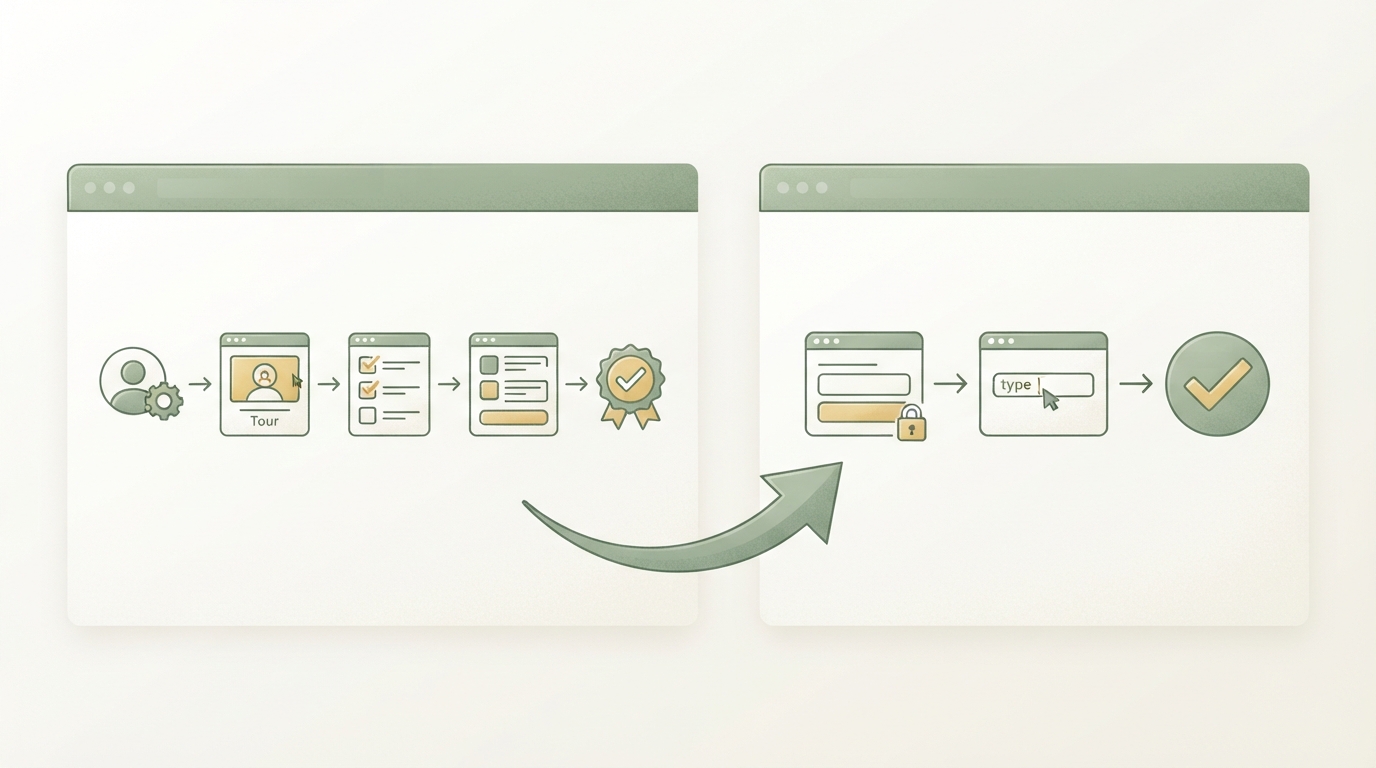
Most teams confuse onboarding with a product tour. They build five steps, three tooltips, and a welcome video. The user clicks through, understands the interface, but hasn't actually achieved anything yet. And the next day? Gone. No habit, no reason to stick around.
A good onboarding flow does the opposite. It gets the user to the moment where they realize "this solves my problem" as fast as possible. Reducing onboarding steps before the first value moment—that's the measurable definition behind it, not some vague formula. If you're still hunting for a product idea before onboarding is even a topic, it's worth checking out profitable niches for your first SaaS first.
The aha moment: the metric that actually matters
The aha moment is the point where a user first experiences your product's core value, not just understands it. For Slack that used to be the 2,000-messages mark, for Facebook it was 7 friends in 10 days. Often-cited examples, but also debated ones.
Aha moment = the first action where the user sees their specific problem solved. For your SaaS, this moment is probably much smaller than Slack's or Facebook's. Maybe it's the first report created, the first automated email sent, the first reply from a customer through your tool. What matters is that you need to know this moment before changing anything about onboarding. Without it, every optimization is just guesswork.
Why most onboarding fails
Most onboarding fails because it tries to explain the product instead of leading the user to a result. It's a deeply rooted mistake, because it feels right.
As a founder, you know your product inside and out. You want the user to understand how much work and how many features went into it. So you show everything. The problem: the user doesn't want to know that. They want their problem solved, ideally within the first two minutes.
Three patterns keep showing up:
- Too many steps before the first value moment. Filling out a profile, inviting a team, setting preferences—before any result is even visible.
- Empty states with no example. The user lands on a blank dashboard and has no idea what to do first.
- Generic onboarding for everyone. A freelancer and a 50-person team need different first steps, but get the same flow.
Something I got wrong myself early on: I thought more explanation would build more trust. In one of my own tests, I cut the onboarding from five explanatory steps down to a single one—right after signup, a pre-filled example instead of a tour through every menu item. The activation rate—the share of users who actually made it to their first result—rose from just over 20 percent to nearly 40 percent. Explaining feels safe to you as the founder, but it doesn't bring the user any closer to their goal.
Step 1: Define your aha moment with data, not gut feeling
Before you touch a single onboarding screw, you need to know which action, among active, paying users, most often precedes upgrading to a paid plan or sticking around long-term. You find that out by looking at your existing user behavior, not by guessing in a team meeting.
Look at your 20 to 30 most active users and find the action that nearly all of them took in the first week. For an analytics tool, that might be the first report viewed. For an automation tool, the first automation switched live. That action is your candidate for the aha moment.
If you don't have user data yet because you're just starting out, the principle behind Rob Fitzpatrick's Mom Test method helps here too: don't ask people what they want, watch what they actually do first when they're in the product with no guidance. That's often where the real aha moment comes from, not from your idealized version of it.
Step 2: Cut every step that doesn't lead to the aha moment
Every step in your onboarding that doesn't directly feed into the aha moment is costing you users. This is the hardest but most effective rule of onboarding redesign.
Take your current onboarding and lay it out as a list. Next to each step, write a single question: does this bring the user closer to their first win? If the answer is no, cut the step or push it to later.
Typical candidates to cut or postpone:
- Filling out a complete profile (can come later)
- Inviting team members (often a step after the first success, not before)
- Payment details, if a trial period exists
- Preferences and settings that work fine with defaults
I see this everywhere: lots of steps before the first result, hardly any users who actually get there. After trimming down to only the truly necessary steps, the share of users reaching their first success can rise noticeably.
Step 3: Build a pre-filled state instead of an empty dashboard
An empty dashboard is the biggest silent killer in onboarding, because the user has no idea what to do first. The fix: show them an example before they enter anything themselves.
Concretely: populate the dashboard, project, or report with demo data before the user enters their own. Notion does this with a pre-filled example page. Many CRM tools show a sample contact with fictional data. The user immediately sees what the end result looks like and just has to replace it with their own data.
This works because people find it easier to adjust something than to create it from nothing. An empty text field feels intimidating. An example you just need to tweak feels doable.
Step 4: Personalize the first steps by user type
Different user types need different first steps because they're trying to solve different problems. A single question at signup is often enough to noticeably improve the path.
Ask at registration: "What do you mainly want to use [Product] for?" with two to four answer options. Depending on the answer, show a different first step. The solo founder gets a different starting point than an agency's marketing team, even though both end up using the same software.
This doesn't need to be complicated. Even a simple two-path fork almost always beats a single flow for everyone. What matters is that the answer actually changes something—otherwise the question is pure decoration.
Step 5: Measure activation, not just signups
Increasing activation only works if you actually measure it, separately from raw signup numbers. Signups tell you nothing about whether someone is actually using your product.
Define a clear activation metric: the share of new users who reach the aha moment within a set timeframe, say 7 or 14 days after signup. Log this number weekly in a simple dashboard or spreadsheet.
This is where most teams go wrong with tracking—I've experienced this myself: you watch signups, celebrate growing numbers, and only realize months later that hardly anyone actually got activated. Once you're watching the activation rate, every onboarding change becomes an experiment with a measurable outcome. You test a version, check the number a week later, and keep whatever works better.
Before and after: a real-world example
Picture a simple analytics tool for online shops. Before, the onboarding flow looked like this: sign up, confirm email, fill out profile, connect shop, invite team, add payment method, only then the empty dashboard.
Seven steps before any result was even visible. No wonder many users dropped off somewhere along the way without ever seeing the tool's actual value.
After: sign up, connect shop, and immediately a pre-filled demo dashboard with sample data from a real online shop. The user sees what a finished report looks like in under two minutes, complete with real revenue numbers and trends. Team invites and payment details come afterward, as an optional second step.
The difference isn't more features. It's that value now comes before the admin work, not after. That's the core of rethinking your SaaS onboarding.
Tools and approaches compared
There are several ways to implement onboarding technically. Which one fits depends on how much time and budget you currently have.
| Approach | Effort | When it makes sense |
|---|---|---|
| In-app tooltips (e.g. with tools like Userflow or Appcues) | Medium | When UI explanation is needed, but use sparingly |
| Pre-filled demo data | Low to medium | Almost always, especially for dashboards and reports |
| Personalized paths by user type | Medium | Once you have 2+ clearly distinct user groups |
| Personal onboarding calls | High | Early stage, few but important first customers |
| Post-signup email sequence | Low | Supplementary, never a substitute for the product experience itself |
Important: none of the tools on this list will fix a bad onboarding concept. Structure, sequence, and the aha moment come first. The tool comes after.
How real products solve this
Some products solve onboarding by making their core value visible extremely early, often before actual use even begins.
SnapTrade, for example, connects fintech apps to brokerage accounts for real-time portfolio data. For an API product like this, the aha moment for developers is often the first successful test request in the documentation, not the finished integration. Based on our research, SnapTrade is estimated at roughly $4.5 million in MRR with about 142,000 monthly visits—clearly an estimate, not an official figure.
Vector identifies anonymous website visitors for B2B marketing teams. Here too, the quick first glance is what counts: as soon as a user sees the first recognized company names after connecting their website, the aha moment is reached, usually within minutes. Estimated MRR, based on our data, sits at around $1.16 million—again an estimate, not a confirmed figure.
If you want to build a tool like this yourself, instead of just admiring other people's numbers—that's exactly what Starte.ai is for, from initial research all the way to a finished concept.
Frequently asked
What is the aha moment in SaaS onboarding?
The aha moment is the point where a user first truly experiences your product's core value, not just understands it. For Slack that used to be the 2,000-messages mark, for Facebook it was 7 friends in 10 days. You need to know this moment for your own product before changing anything about onboarding.
Why does most SaaS onboarding fail?
Because teams try to explain the product instead of leading the user straight to a result. Typical mistakes are too many steps before the first value moment, empty states with no example, and generic onboarding for every user type. Most founders show too much because they're proud of their product, when really the user just wants their problem solved.
How do you find the aha moment for your own product?
Look at your 20 to 30 most active users and find the action almost all of them took in the first week, instead of guessing in a team meeting. If you don't have user data yet, the principle behind the Mom Test method helps: watch what people actually do first without any guidance.
How do you measure activation in onboarding?
Activation is the share of new users who reach the aha moment within a set timeframe, for example 7 or 14 days after signup. This should be tracked separately from raw signup numbers, since signups say nothing about whether someone is actually using the product. Logging this number weekly turns every onboarding change into a measurable experiment instead of flying blind.
Written by
Bohdan BernatekFounder, Starte.ai
Founder of Starte.ai. Built a business to 125,000+ organic leads and seven-figure revenue — and now works with founders personally, deriving a strategy for their own brand from data across thousands of real projects and producing the creatives for it.