Creating ad images with AI: the standard mistake — AI makes pretty pictures, just not yours
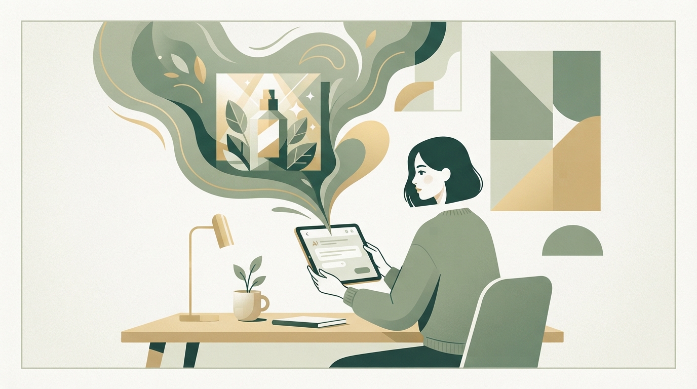
You open an AI image generator, type "professional business person using laptop," and get back what millions of others get too: smooth faces, stock-photo aesthetics, no soul. The trick isn't telling AI what to make — it's showing it how your brand looks — through a visual baseline and structured prompts.
Creating ad images with AI isn't "just type a prompt" anymore. It's a strategy for building consistency while keeping the cost advantage. I got this wrong for years: throw in a prompt and hope. And here's the trick: AI isn't strongest at creating from nothing — it's strongest at amplifying something that already exists.
What I keep seeing with founders: they launch a product, and the first three ads still look reasonably consistent. Then, usually within two to three weeks, things go off the rails. One image looks wrinkled, the next too polished. The style drifts. Viewers get the sense there's no plan behind it — and click away.
That's the point where most people give up or hire expensive designers. But there's a third way. If you're already working on your social media content strategy, this image question belongs right in there — copy and visuals need to come from the same brand world.
Step 1: Define your visual baseline
Before you write a single prompt, you need to know how your brand looks.
That sounds obvious, but it's almost never actually done. Many founders have a vague idea in their head — "kind of minimalist," "modern," "trustworthy" — but no clear reference an AI can work from.
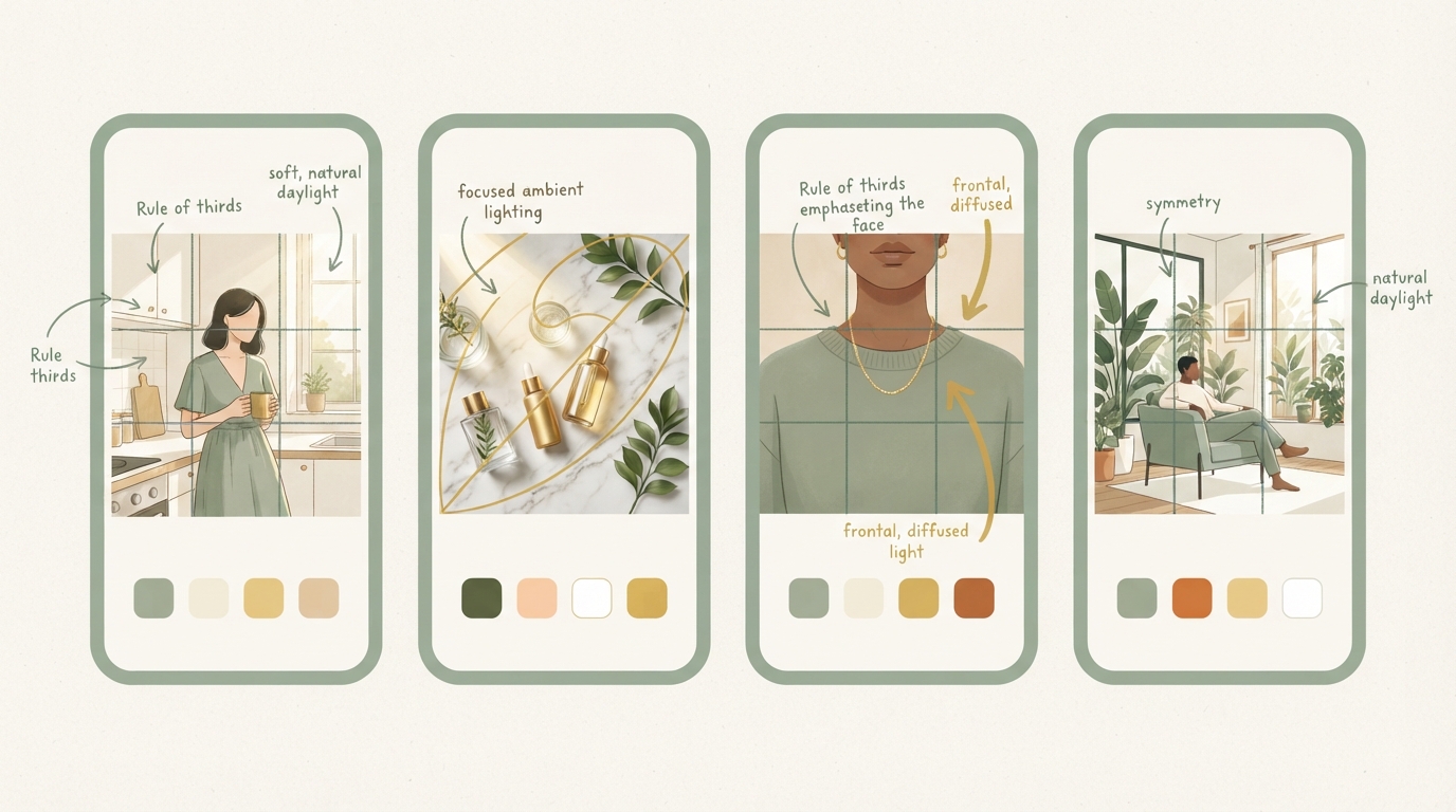
I always pull out 5–8 ads I think look great — not to copy them, but to understand what colors, what cropping, what lighting works for them. From competitors, from the industry, or just from brands whose tone I like.
Write down what you notice:
- Color palette: Which 3–4 colors dominate? (e.g., dark blue, white, orange accent)
- Photo style: Studio setup or in the field? Natural light or dramatically lit scenes?
- Composition: Centered or asymmetrical? People in focus, or product/space?
- Lens/perspective: Close-up (portrait) or wide (environment)?
- Movement/energy: Action-heavy or calm and still?
- Typography, if there's text in the image: Size, position, style, contrast against the background.
These five to eight examples are your visual reference library. Write them down or collect them in a file. This becomes your guide for every AI generation to come — and for any designer you bring in later.
Step 2: The prompt structure that actually works
A bad prompt is a list of adjectives. A good prompt is a set of instructions that pulls AI images for ads in your direction — leaving room for variation without drifting off-brand.
The standard structure works like this:
- Main scene (what's happening): "A founder sits at a desk, working on their laptop, with a cup of coffee and a notebook beside them."
- Visual style (from your baseline): "Professional studio lighting, natural daylight from the left, minimalist bright background, gray tones with dark blue accents."
- Photo quality & technique: "Sharp, 85mm portrait-lens aesthetic, shallow depth of field, rendered at 1200×630px for social media."
- Feeling/message: "Focused, confident, not posed — like a genuine work moment."
- What to avoid: "No cartoon elements, no overly smooth skin, no neon colors, no stock-photo smile, no text overlays."
A real example for you:
Female founder, in her 30s, sitting at her desk, looking at a screen with focus in her eyes. Minimalist white home office, gray tones with a dark blue accent. Soft daylight from the right, 85mm portrait aesthetic. Focused, authentic, not posed. No artificial perfection, no exaggerated colors, no generic stock-photo energy.
That's not "professional woman at desk" — that's an instruction.
The difference in output is enormous.
Step 3: Image generation for marketing — consistency through variations, not duplicates
A single AI creative isn't worth much. What you need are variations on one theme — same style, different scenarios.
Instead of generating five completely different scenes, work with three to four variants per scene:
- Variation 1: Main scene (as described above)
- Variation 2: Close-up, different angle, same space/feel
- Variation 3: With product/tool in the background (subtle)
- Variation 4: Add movement (hand to mouth, looking forward)
This lets you test in ads (different crop options, different hook copy) — without losing the style.
Per month, you can generate three to five different scene sets this way: teamwork, solo work, moment of success, learning moment, relaxation. Each built the same way, same color palette, similar lighting.
This lets your viewers recognize your brand — not because the image is identical, but because it feels consistent.
Step 4: Know the limits — where AI falls short
To be honest with you: there are scenes where AI simply isn't good enough yet.
| AI weakness | Problem | Solution |
|---|---|---|
| Hands & movement | Fingers often distorted or too many knuckles | Post-editing or choose an angle that hides hands |
| Text in image | Letters warped, words invented | Generate image without text, add text in Adobe Express or Figma |
| Very specific products | Exact UI or logo rarely rendered correctly | Use a screenshot or real design mockup |
| Multiple people with faces | Five eyes or identical-looking people | Reduce to one person per image or use a real photo |
| Authentic emotion in close-ups | Smiles look uncanny, subtlety is missing | Generate focus/neutral expression instead of strong emotion |
With hands holding a product in frame, the result is often tricky — sometimes it works, sometimes it needs post-editing, which then eats up the time you were trying to save in the first place.
The solution: use image generation for marketing for the simple, broad scenes (person at a desk, room, lighting atmosphere). For complex details (your actual product, multiple people, text, hands) use real photography, designers, or hybrid approaches.
Step 5: Brand consistency across tools and time
If you're now thinking "that sounds like a lot of admin" — yeah, a little. But it's manageable:
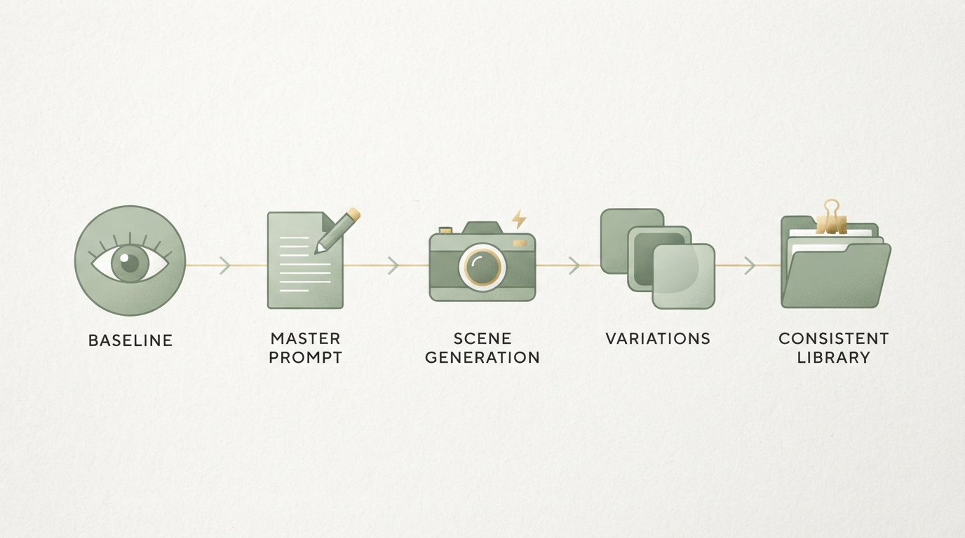
- Save your master prompt as a template. Only change the scene, not the style description.
- Always generate at the same resolution (e.g., 1200×630 for LinkedIn/Facebook, 1080×1080 for Instagram, 1200×1500 for TikTok vertical).
- Use the same AI platform (to minimize variance — different tools mean different output).
- Check every output: Does the color match? The tone? The composition? If not, regenerate with an improved prompt.
This isn't automated, but it's repeatable. After the fourth or fifth round, you'll only need 3–5 minutes per generation, because you'll know which prompt needs which tweak.
The hidden reality: AI images + human craft = best of both
The honest truth is that the best strategy is hybrid.
Founders I know who are really successful at this do it like so: AI for the common, standardized scenes (person at desk, team moments, abstract beauty shots). But the four or five images per month that actually go viral — they shoot those themselves or bring in a photographer for a day.
That's not a contradiction. That's smart spending. AI handles the 80% where it's strong. The 20% with real differentiation potential — that's where you invest in real production.
It works psychologically too: if your first 20 ads are AI-made and performance is mediocre, and then one image comes along from a real photo shoot — the difference is instantly noticeable. People respond. And then you also know which direction your AI prompts should head in.
That exact step — choosing between standard production and real differentiation — is where most beginners waste time. They try to do a hundred percent with AI, and then you realize: it wasn't the AI all along, it was your prompt that was generic.
That exact step — building your own visual baseline cleanly and pouring it into a prompt template — is something almost nobody manages to pull off cleanly alone. At Starte.ai, we look at what's actually working in your market for ads and creatives, and derive an image strategy from that which fits your brand instead of just any brand. If you want, the first strategy call is free, and you can take a free look at what this could look like for your product.
Midjourney and DALL-E 3 are currently more consistent in style and quality. Runwayml is good if you need video content. Flux and Grok are faster but less consistent in style. The choice depends on how much time you want to invest in prompt optimization versus how much speed matters to you.
That depends on your budget and your channels. If you only use LinkedIn, 3–5 sets are enough. If you're running Instagram, TikTok, email, and Meta, you need 10–15 different scene sets per month to test and stay fresh.
In Germany and the EU: yes, as long as you're not making users unable to tell it's AI. For B2C ad images, this is rarely an issue. But if you're generating portraits of real-looking people and presenting them as an actual person — that's a problem. Keep the line clear: real people for trust, AI for scenery and concept.
No. Every image needs a quick check: colors, hands, text, whether the tone fits. 30 seconds per image saves you from running ads that underperform because they look off.
Frequently asked
How do I create ad images with AI that match my brand?
The key is a visual baseline: you collect 5–8 ad images that match your style and write down the color palette, photo style, and composition. You then use this reference library as the foundation for every prompt, instead of just giving the AI vague adjectives. That keeps the output consistent and stops it from drifting into stock-photo territory.
How should a good prompt for AI ad images be structured?
A good prompt has five parts: main scene, visual style, photo quality and technique, feeling or message, and what to avoid. Instead of a list of adjectives, it's a real set of instructions with concrete details like lighting setup, lens, and color accents. According to the post, that's exactly what makes the difference between generic output and images that actually look like your brand.
Where does AI image generation for ads hit its limits?
It gets difficult with hands and movement, readable text in the image, very specific products with their own logo, multiple people with visible faces, and subtle real emotion in close-ups. In these cases, the post recommends real photography, designers, or a hybrid approach instead of pure AI generation. For simple, broad scenes like a person at a desk, though, AI works well.
How do AI-generated ad images stay consistent over time?
You save your master prompt as a template and only change the scene, not the style description, and always generate at the same resolutions for the relevant platform. You should also stick with the same AI platform, since different tools produce different output. You then check every output for color, tone, and composition before approving it.
Written by
Bohdan BernatekFounder, Starte.ai
Founder of Starte.ai. Built a business to 125,000+ organic leads and seven-figure revenue — and now works with founders personally, deriving a strategy for their own brand from data across thousands of real projects and producing the creatives for it.